Composite consist of at least two images shot differently and is merged. To make two images blend and to look like one single image I follow these tips:
- Matching Luminosity and Contrast,
- Matching Saturation, and
- Matching Tones
For simplicity, we will have two images one is background, and the other is a cut out of a model which we will refer to as a model layer.
- Matching Luminosity and Contrast
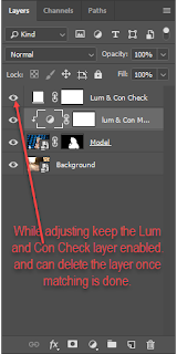
Before matching the Luminosity and Contrast, we need to identify the luminosity and contrast level of the model layer to the background layer. To do so, we take a solid color layer and set the saturation layer of solid color is set to 0 and change the blending mode to color. This will convert the image to black and white, and then we can identify the brightest and darkest part of the background image and the model image. Use the curve tool to match the brightness and darkness of both layers (background and model). I usually have the model layer little brighter than background and background layer little darker than the model layer. Depending upon to which layer you are applying the adjustment curve you can clip the curve adjustment layer to that layer so that it is not affecting any other layer.
You can also use Lumenzia plugins to find the different level of luminosity.
Antti Karppinen is known for creating beautiful storytelling imagery; In his video in this link
Antti's video, he describes the technique to match the saturation of composite. Steps involved are as follows:
First, we need to find out the saturation level of the colors which needs to be altered. Create a selective color layer set the radio button to Absolute. For colors Reds, Yellows, Greens, Cyans, Blues, and Magentas set the value of Cyan, Magenta, Yellow to -100% and Black to 0% and for Whites, Neutrals, and Blacks set the value of Cyan, Magenta, Yellow to 0% and Black to +100 %, this will convert the image to black and white, and the highest saturated color in the picture will be brightest. Once the highest saturated area is identified then either use curve or Hue Saturation adjustment layer to match the saturation of composite.
In this video of Antti Karppinen
Antti's video, he describes the technique to match the tones of the composite. Steps are involved as follows:
First, we need a color map of the composite which will help us to identify the area which requires our attention. To create the color map we need to get a solid color layer with 50% brightness and set the blending mode to Luminosity. To exaggerate the result, we add a Hue / Saturation layer and increase saturation to 100%. Once we have color mapping done then the objective is to have same color grading throughout the picture and to achieve this, we take help of Selective Color Layer and mainly modify color for Neutrals Whites and Blacks.
References:
Annti Karppinen
Kelbyone
Petapixel
Phlearn
Piximperfect Channel


