Friday, January 15, 2021

Soundless Flight


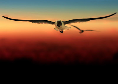
Inspiration for this work struck while I was in Galveston, Texas, USA. The sun was setting, bathing the beach in glowing orange and yellow and pink. Seagulls clamored for my attention: feeding one led to another, and another, until I was surrounded by them, their wings glinting with color. I found myself mesmerized by the way they flew, how they cut such precise shapes against the darkening sky, and I knew I needed to capture that moment. 


It took several trips before I found the perfect shot. One bird unmistakable in the foreground, another out of focus behind it, both caught in the last bright orange stripe of dying light. They were level with my eyes as I brought my camera up to snap the picture that would be the foundation of my creation. There's harmony in the colors I see here, a unity flowing between the beady glint of the seagull's eyes and the blending of colors, from orange to maroon to black. 

Looking at this art, I see freedom. A carefree flight, a sense of nonchalance that every grounded creature envies. I feel the weight of gravity, and I know that while I can't join the avian life populating our world, I will find my own liberation.

All photos are available for purchase as Limited Edition full-color prints. I use an archival 100% cotton fine art paper Photo Rag Baryta by Hahnemühle with an inkjet coating, giving it a high-gloss finish and standards that guarantee long-lasting color and saturation. Each print comes with a Certificate of Authenticity, indicating that you have purchased my original work. Each print is hand-signed, numbered, titled, and dated on the 2" white border. All prints are shipped rolled in a protective hard PVC tube to any country worldwide.

Photography: Color, Digital, Manipulated, Giclee on Paper.

Size: 24X36 (Photo Rag Baryta)

Link to purchase the art work Kreativelens Art Gallery
Tuesday, January 8, 2019

Kreative Workflow - Six steps journey of exposure from camera to printer


Step 1. At the photo shoot location, images are transferred to a portable drive.  I use RavPower Filehub Plus to transfer images.

Step 2. A folder is created and naming convention is followed as shown below

For Event Photography - Clientname_Eventname_Location
For Portrait - Clientname_Portrait_Location
Frnds & Family - FnF_Ocassionname_Location / FnF_Tripname_Date
Blog - Blog_BlogTitlename_Location
Concept Shoot - Conceptname_Modelname_Location
Workshop Shoot - Workshopname_Organizername_Location

Fixed name
Variable

Step 3. Images are transferred to work machine under Raw folder (stored in external hard drives).

Step 4. Images are brought to Lightroom and images are renamed. The naming convention is same as Folder naming convention and suffix by sequence id.

Step 5. Editing is done in LR and PS and final images are exported to Edited folder (Naming convention same as above).

Step 6. From edited folder, images are sent to printing lab and online gallery for client access.


Monday, November 5, 2018

Kreative Lighting - Split Lighting


ABOUT:

Split Lighting Setup for this portrait. Split lighting at its most basic level is constructed with a single light source placed 90 degrees offset from the subject and a bit higher than eye level, lighting one half of the face, and leaving the other in shadow.

The thing that distinguishes Split Lighting from Short or Broad lighting is the placement of the subject’s head- Split Lighting is usually taken with the subject facing square to the camera.

SETUP:

Light is next to the model at 90-degree angle.

MY TAKE ON THIS SET UP:

  • Simple to set up,
  • This creates more drama,
  • Usually applied to men, and
  • Create a sense of intrigue.

SAMPLES:

Collection of portrait pictures using Split Lighting set up from various photographers.

REFERENCES

Sunday, October 7, 2018

Kreative Lighting - Clamshell Lighting


ABOUT:

Clamshell Lighting uses two opposing light source. One from above at an angle of 45 degrees towards the model and the other one from below again at 45 degrees towards the model. Top light is the key light and the lower one is a fill light. If top light is set at 100% power then the bottom one will be set at 40% or lower.

SETUP:

Fill light should not be overpowering the key light.


Lower light is a fill light and is at 40% of its full power.


Upper light is a fill light and is at its full power.


MY TAKE ON THIS SET UP:

1. Simple to set up.
2. This light set up flatters practically any face.
3. Great for headshots.

SAMPLES:

Collection of portrait pictures using  Clamshell Lighting set up from various photographers.

References:


Monday, October 1, 2018

Kreative Lighting - Butterfly Lighting


ABOUT:

Butterfly lighting consists of a sole light aimed straight at the subject and raised high enough to create a downward shadow on the subject. This causes a butterfly shadow to appear directly under the subject's nose.

SET UP:


Here the shadow of the nose is directly under Mr. Kay's nose. Mr. Kay is facing directly towards the camera, the light is above camera pointing straight towards Mr. Kay's face.


The height of the light dictates the length of the shadow. I prefer shadow not to cross halfway distance between nose and lips.


MY TAKE ON THIS SETUP

1. Butterfly lighting accentuates cheekbones and jawlines. 
2. I do not find this lighting flattery on the weathered face.
3. I use this lighting on a young model with clear skin.
4. I avoid this lighting on a model with an oval face.
5. Use a reflector to fill in shadow under the chin.

SAMPLES

Collection of portrait pictures using  Butterfly Lighting set up from various photographers.

References
Picture Correct
Digital Photo
Improve Photography
Photography by Neilvan Niekerk

Tuesday, September 25, 2018

Kreativelens Workflow for Composite - 1


Composite consist of at least two images shot differently and is merged. To make two images blend and to look like one single image I follow these tips:

  • Matching Luminosity and Contrast,
  • Matching Saturation, and
  • Matching Tones

For simplicity, we will have two images one is background, and the other is a cut out of a model which we will refer to as a model layer.

  • Matching Luminosity and Contrast

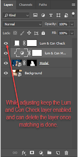
Before matching the Luminosity and Contrast, we need to identify the luminosity and contrast level of the model layer to the background layer. To do so, we take a solid color layer and set the saturation layer of solid color is set to 0 and change the blending mode to color. This will convert the image to black and white, and then we can identify the brightest and darkest part of the background image and the model image. Use the curve tool to match the brightness and darkness of both layers (background and model). I usually have the model layer little brighter than background and background layer little darker than the model layer. Depending upon to which layer you are applying the adjustment curve you can clip the curve adjustment layer to that layer so that it is not affecting any other layer.
You can also use Lumenzia plugins to find the different level of luminosity.


  • Matching Saturation

Antti Karppinen is known for creating beautiful storytelling imagery; In his video in this link Antti's video, he describes the technique to match the saturation of composite. Steps involved are as follows:
First, we need to find out the saturation level of the colors which needs to be altered. Create a selective color layer set the radio button to Absolute. For colors Reds, Yellows, Greens, Cyans, Blues, and Magentas set the value of Cyan, Magenta, Yellow to -100% and Black to 0% and for Whites, Neutrals, and Blacks set the value of Cyan, Magenta, Yellow to 0% and Black to +100 %, this will convert the image to black and white, and the highest saturated color in the picture will be brightest. Once the highest saturated area is identified then either use curve or Hue Saturation adjustment layer to match the saturation of composite.


  • Matching Tones

In this video of Antti Karppinen Antti's video, he describes the technique to match the tones of the composite. Steps are involved as follows:
First, we need a color map of the composite which will help us to identify the area which requires our attention. To create the color map we need to get a solid color layer with 50% brightness and set the blending mode to Luminosity. To exaggerate the result, we add a Hue / Saturation layer and increase saturation to 100%. Once we have color mapping done then the objective is to have same color grading throughout the picture and to achieve this, we take help of Selective Color Layer and mainly modify color for Neutrals Whites and Blacks.


References:
Annti Karppinen
Kelbyone
Petapixel
Phlearn
Piximperfect Channel

Saturday, July 7, 2012

Adjustment Layer tweaks - Photo Filter

Use Adjustment Layers to fine-tune the tones and colors in your image with complete control.


When you first open an image in photoshop, you may decide to add more contrast, correct a color cast, convert to black and white or even turn your subject green. There are two ways to make adjustments as these. The first way is to go to image -> Adjustments and choose from the list of options. Any tweaks made here are applied directly to your image pixels. You can get perfectly good results by doing this, but what if later on you have second thoughts. The smart way to make any changes is to use Adjustment Layers. To apply these, click the circular icon at the bottom of the Layers palette or go to Layer -> New Adjustment Layer. Each adjustment you make appears in the layers palette as a separate layer that affects all layers below it. This means you can take advantage of all the editing choices that working with layers enables.

Photo Filter:

Photo Filter offers a handy list of preset color filters that mimic the effects of traditional lens mounted filters. Most Adjustment Layers comes with a list of presets and are usually accessed via a drop – down menu. These can be a great help, particularly if you're not sure exactly how to treat an image, as you can use them to kick-start your creativity.